

Identity stops at login but AI needs continuous governance around actions, tools, and data.

Grant AI precise, scoped access, not broad human-level permissions that can be manipulated or fail.
Enable AI to work across multiple systems with MCP efficiently and accurately without context bloat.

Track every AI action, policy applied, and outcome produced across your systems.
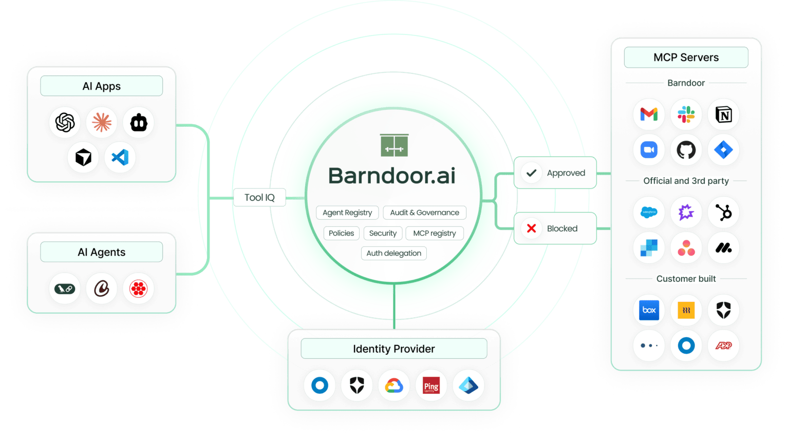
Discover and centralize AI apps, agents, and MCP servers so usage is governed instead of hidden or unmanaged.
Govern AI by context, specific actions, tools, and data types — not just inherited human permissions.
Apply access control at the moment AI acts, preventing unsafe or out-of-scope actions before they impact systems.
Track every AI action with clear attribution across users, agents, tools, and MCP servers as usage scales.

Define policies once and enforce them consistently from local development through staging and production.
Surface only in-policy, relevant MCP tools for each request to maximize your context window and agents stay focused, reliable, and accurate.
Use MCP servers running locally, in your cloud, or provided by vendors without changing how control is applied.
Work with the AI apps and agent frameworks you choose. Barndoor stays independent of models and vendors as the AI landscape evolves.
Fully managed deployment for fast setup and ongoing updates.
Deployed in your cloud environment to meet security and compliance requirements.
Run entirely within your infrastructure for maximum control and data residency.

Enterprise AI Adoption
January 14, 2026

Enterprise AI Adoption
January 13, 2026